Plot

A plot is a curve describing a changing value. The curve is drawn between the data samples it receives from the data source. The samples can arrive sporadically, or at a fixed interval. If the data source is known to be sampling at a fixed rate the plot can be set to this sample rate. This way, the curve will be shown correctly even if there are some elasticity in the transmission of the samples. If the samples come at an irregular rate, set the sample rate to 0. This will make the graph position the samples along the time axis according to the sampleʼs timestamp. If there is more than one plot in the graph, each plot will update when new data arrives for that plot.

When adding a plot to an axis, the new plotʼs Plot control panel will be placed under that axis in the Graph configuration panel.
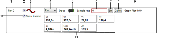
Figure 1. Plot Controls

  1. Plot label.
  2. Enable check box.
  3. Line color indicator.
  4. Plot type selection
  5. Data sink.
  6. Sample rate edit box.
  7. Sample rate set button.
  8. Delete plot button.1
  9. Plot status.
  10. Show Cursors option.
  11. Cursor data.

Adding and Connecting a Plot

To connect a plot to a data source, drag the data source plug symbol and drop it on the New plot sink connector symbol.

Disable a Plot

To stop showing a plot in the graphʼs plot area, deselect the plotʼs Enable check box.

Change the Plot Color

The plot line's color can be changed:

  1. 1.

    Click on the plot's line color indicator.

  2. 2.

    In the dialog box that opens, adjust the color by dragging the Red, Green, and Blue sliders. Press OK.

  3. 3.

    The plot line and the line color indicator has now changed to the new color.

Change Plot Type

The plot type can be changed between Plot and Points by changing the selected type in the Plot type selection. The Plot type will show the graph plot as a continuous line while the Points type will show the actual plot samples as dots only.

Plot Data at a Fixed Sample Rate

If the data source sends data to the plot at a fixed rate, the plotʼs sample rate can be set. Enter the number in the Sample rate text box and press the Set button.

Plot Timestamped Data

If the data arrives at irregular intervals, the graph will present a more accurate view if the samples are placed using the sampleʼs timestamp.

To plot using timestamps, enter 0 into the Sample rate text box and press the Set button.

Remove a Plot

To remove a plot from an axis, press the Delete button in the plot's control panel.

Cursors

If the Show Cursors option is enabled, two vertical cursors will show up in the plot area. The cursors can be moved by the mouse and the Plot Controls panel shows data related to the cursors.