
4 Melody Application Builder
Application Builder is a tool that facilitates the visual representation of an application’s hardware and software components, offering a clear view of component dependencies and context within the project. Supported layouts include top-down or left-to-right, organized by levels of abstraction from Main, down to Libraries, Drivers, PLIBs, and finally MCU hardware.
4.1 Introduction
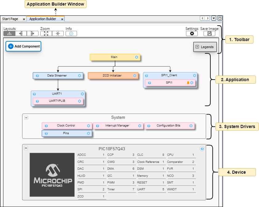
The Application Builder UI showcases all loaded Melody Components, including Libraries, Drivers, and Hardware Peripherals. Additionally, the Toolbar provides quick access to commonly used functions and commands within the application builder. The Device section offers a summary of the MCU device, detailing the number of each type of peripheral instance.
| # | User Interface | Description |
|---|---|---|
| 1 | Toolbar | The Toolbar offers quick access to frequently used functions and commands within the application builder, including adding Component, searching, adjusting layout, zooming, saving snapshots, and more. |
| 2 | Application | The Application includes all user-added components necessary for the project, managed under the main manager. |
| 3 | System Drivers | System Drivers provides system-level core functionality, like: Clock, Interrupt and Pins. These are essential preloaded components that are automatically included when a new project is created. These components cannot be unloaded or removed. |
| 4 | Device | The device section includes information about the MCU device and its capabilities, primarily listing peripheral names and the total number of instances. |
4.2 Legends, Icons & Color Codes
This provide a visual representation to map various UI components.
| # | User Interface | Description |
|---|---|---|
| 1 |  | The Application and Example support non-register-based APIs, functionalities, and main. |
| 2 |  | Drivers & Libraries support both Configuration and Firmware portability, providing an easy-to-read and efficient abstraction to the functionality of the peripheral. |
| 3 |  | Peripheral Libraries (PLIB) provides Register initialization, interrupt ISRs and APIs. |
| 4 |  | Hardware Peripherals (Initializers) provides only Register Intialization API. |
| 5 |  | Hardware determines the device's capabilities and displays all available peripheral interfaces. |
| 6 |  | UI Configuration allows you to access the configuration view of the selected component. |
| 7 |  | Redirects to component API Reference documentation. |
| 8 |  | Notifications indicate the presence of alerts, including warnings, hints, and other messages. |
4.3 Toolbar
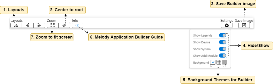
The Toolbar offers quick access to frequently used functions and commands within the application builder, including adding components, searching, adjusting layout, zooming, saving snapshots, and more.
| # | User Interface | Description |
|---|---|---|
| 1 | Layouts | The Layout feature offers various arrangements for the application builder, such as top-to-bottom or left-to-right configurations. These are presented by degree of component abstraction from main, to libraries, drivers, PLIBs and finally MCU hardware. |
| 2 | Center to root | Zooms into the application dependency tree, using the topmost parent (main) as the root. |
| 3 | Save Builder image | Save the application builder UI as a PNG image. |
| 4 | Hide/Show | Toggle the visibility of various components in the application builder, such as Legends, Device, System, etc. |
| 5 | Background theme for builder | Enables the selection of one of the available background effects. |
| 6 | Melody Application builder guide | Redirects to the user guide that outlines the usage and features of the application builder. |
| 7 | Zoom to fit screen | Adjusts the builder UI to fit the window size. |
4.4 Build Stack: Add Component
The Add Component feature enables users to add, search, and filter components or peripherals according to their requirements. It simplifies navigation by enabling users to explore components based on their available and active features.
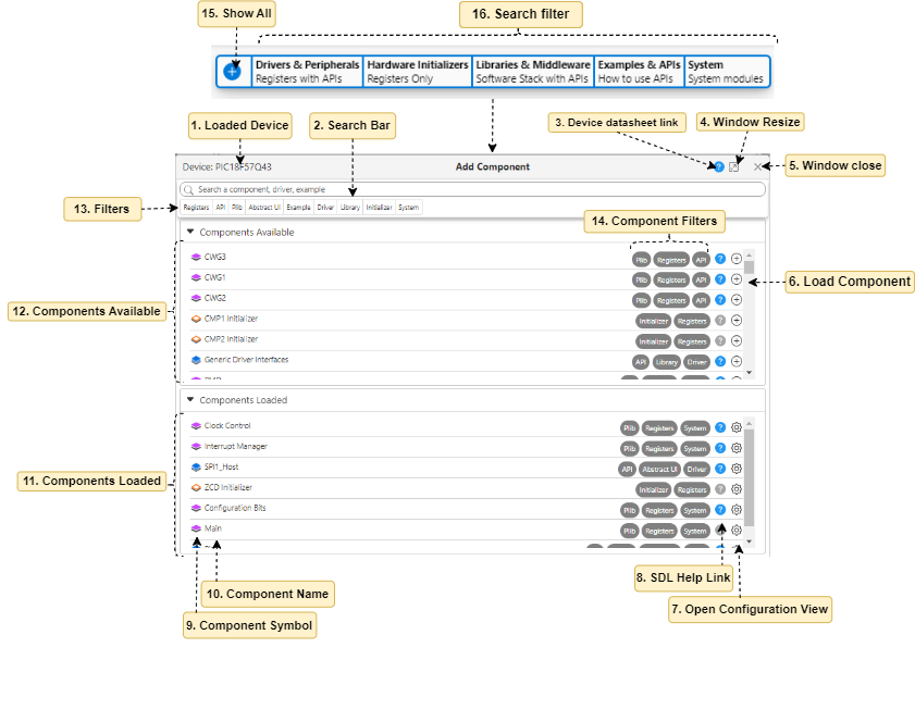
| # | User Interface | Description |
|---|---|---|
| 1 | Loaded Device | Name of the device loaded |
| 2 | Search Bar | Search bar to locate any Component. |
| 3 | Device datasheet link | Redirects to device data sheet PDF. |
| 4 | Window Resize | To maximise and minimise the window size. |
| 5 | Window close | To close the Add Component window. |
| 6 | Load Component | Loads the Component when clicked on the add icon |
| 7 | Open Configuration View | Open the Easy/Register view of the Component. |
| 8 | SDL Help Link | Opens SDL related documents for the Component. |
| 9 | Component Symbol | To determine the type of component(Refer legends in the UI) |
| 10 | Component Name | Name of the Component. |
| 11 | Components Loaded | List of Components which are loaded in the project. |
| 12 | Components Available | List of Component available and can be loaded in the project. |
| 13 | Filters | A list of filters to narrow down or expedite the search process. Example - when clicked on PLIB it will show all the available PLIBs on the device. |
| 14 | Component Filters | Filter tags given to a component. |
| 15 | Show All | Shows all available and consumed Component in the project |
| 16. | Serach Filters | Search filters assist users in making decisions by allowing them to set criteria accordingly. |
- In the following examples, the device used is the PIC18F57Q43.*All reference are w.r.t. above image.
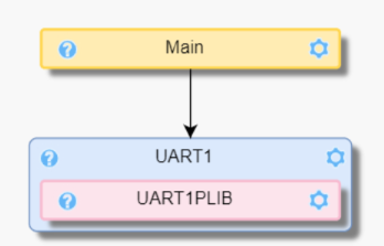
Example Steps Application Builder View Add ADC Peripheral Search & Add - Hover on Add Component.
- Click on Drivers & Peripherals (refer 16)
- Type ADC in Search bar, (refer 2)
- Click on Load Component (refer 6)
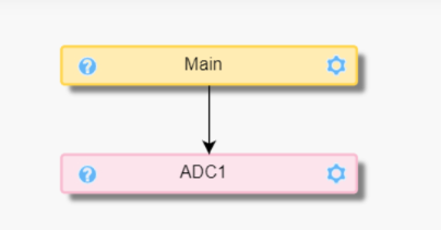
Add UART (Abstract UI) Driver Search & Add - Hover on Add Component.
- Click on Drivers & Peripherals (refer 16)
- Type UART in Search bar, (refer 2)
- Click on Load Component (refer 6)
- Click on Add Dependency, it will open Easy View.
- Select UART1 from UART PLIB Selector.
4.5 Component UI Node
A node is a atomic unit within the builder that constitutes a component node and contains information pertinent to the component.
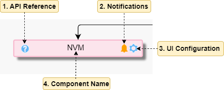
| # | User Interface | Description |
|---|---|---|
| 1 | API reference | Navigates to the API Reference of the Component, if available. |
| 2 | Notifications | Displays component notifications in the form of alerts, hints, warnings. |
| 3 | UI Configuration | Click to open Configuration view. |
| 4 | Component Name | Name of the Component. |
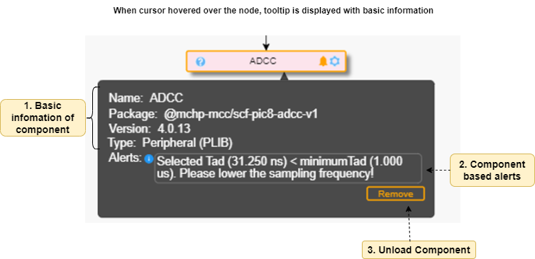
| # | User Interface | Description |
|---|---|---|
| 1 | Basic information of component | Includes essential details such as the Name, Package Name, Version, and Component Type. |
| 2 | Component based alerts | The Component-based alerts parameter is optional and is populated only when a notification icon is displayed in the node/Component. This parameter contains alerts in the form of informational, hint, warning, or error messages. |
| 3 | Unload / Remove Components | Unloads a Component from project. |