3.5.1.1 Edit Panel
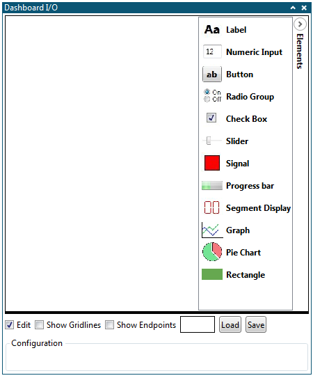
When going into Edit mode (by selecting the Edit box), the Edit panel will become visible. Here the user can customize the dashboard.

Placing Elements on the Dashboard
By default, the dashboard area is empty. Elements can be placed on the dashboard by following the procedure below.
-
Click the Edit checkbox
-
Open the Elements panel in the upper right corner of the dashboard area
-
Click and hold the element
-
Drag the mouse over the dashboard area
-
Drop the element in the dashboard area on the desired location

Configuring Dashboard Elements
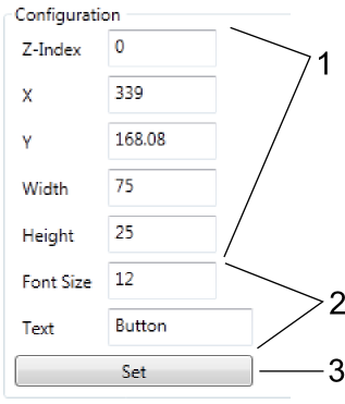
All dashboard elements can be configured when in Edit mode. The parameters will vary depending on element type, but the procedure for changing them is the same.

- Common parameters.
- Element-specific parameters.
- Set button.
-
Click the Edit checkbox
-
Select the element to configure by clicking it. The Configuration window will list the configurable parameters for the selected element.
-
Change the parameters to the desired value
-
Click the Set button
Moving Elements
All parameters related to position and size are available in the element configurations. Elements can also be moved by dragging them around in the dashboard area in Edit mode. Resizing can be done by dragging the black tab in the corner after selecting an element.
Deleting Elements
Loading and Saving
The dashboard can be saved by clicking the Save button in Edit mode. All elements and configuration parameters, in addition to dashboard background color, will be stored.
To load a dashboard, click the Load button and browse to a valid dashboard save file.
The saved file is a text file but could have any file extension containing all configuration parameters for each dashboard element enclosed in curly brackets {} and separated by a semicolon. Each line corresponds to one configuration parameter and the format of each parameter is a list of decimal byte values separated by commas. Each configuration parameter is given by the Least Significant Byte first. The order of the configuration parameters are the same as the order of the configuration parameters in the Configuration window when the Edit option for the dashboard is selected. Comments are marked by double forward slashes "//" and the rest of the line is ignored by the parser when encountering double slashes.
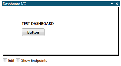
A simple example of a saved dashboard configuration is given below. A more complex example can be found in Auto-Configuration Example.

The file content of the saved configuration for this dashboard is given below.
{
0,
'\0',
0, 255, 255, 255,
158, 0,
};

{
0, // Dashboard ID
0, // Element ID
DB_TYPE_LABEL, // Element Type
0, // Z-Index (GUI stack order)
61, 0, // X-coordinate
46, 0, // Y-coordinate
122, 0, // Width
17, 0, // Height
12, // Font Size
1,
0, // Horizontal Alignment
0, // Vertical Alignment
0, 255, 255, 255, // Background Color
255, 0, 0, 0, // Foreground Color
'T', 'E', 'S', 'T', ' ', 'D', 'A', 'S', 'H', 'B', 'O', 'A', 'R', 'D', '\0', // Text
};

{
0, // Dashboard ID
1, // Element ID
DB_TYPE_BUTTON, // Element Type
0, // Z-Index (GUI stack order)
61, 0, // X-coordinate
70, 0, // Y-coordinate
75, 0, // Width
25, 0, // Height
12, // Font Size
'B', 'u', 't', 't', 'o', 'n', '\0', // Text
0,
};
The first element in the file is the dashboard itself. The first line defines the Dashboard ID (0). Then follows the Title of the dashboard (empty string), the background color of the dashboard (Alpha = 0x00, Red = 0xFF, Green = 0xFF and Blue = 0xFF), and the height of the dashboard (two byte value, LSB first; 152, 0 => 152 = 0x0098 pixels).
The following elements are the Label element and the Button element.
Note that strings are null terminated (\0).
Checkboxes are usually grouped and only one bit per checkbox is used to indicate the checkbox state. For example, for the Label element there are two checkboxes following each other in the Edit window, one named Bold and one Italic. These are combined into one Configuration byte with bit 0 giving the state of the Bold checkbox and bit 1 giving the state of the Italic checkbox. In the example above, this is the 1 between Font size and Horizontal alignment. The value 1 indicates that the Label text format should be bold but not italic.
Drop-down boxes are given as single byte values with a number corresponding to the selected option. The topmost option in the list corresponds to a configuration value of 0. For example, for the Label element the Horizontal Alignment can be either Left=0, Center=1, or Right=2.
Setting Background Color
The square next to the Load button is the Background color selector. Clicking the selector will bring up the Color selector dialog. Use the sliders to select the desired color, then press OK.
