
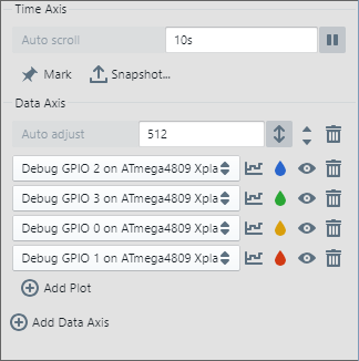
4.3.4 Time Plot Visualization Controls (Right) Pane
The Time Plot Visualization Controls (right) pane is for controlling visualization (graphing) of streaming data.
| Control | Description |
|---|---|
| Offset | When scrolling, “Auto scroll” displayed. When paused, shows the time at the right side of the graph. |
| Scale | Specify the resolution of the time axis in seconds. |

| Pause scrolling or start/continue scrolling. |
 | Freeze the current Time Plot window and mark it with cursors at the bounds. Adjust the cursors as needed. |
 | Save a snapshot of data source plots to a text file (CSV or JSON). Use “Mark” before taking a plot snapshot. |

| Control | Description |
|---|---|
| Offset | When auto adjust enabled, “Auto adjust” displayed. When auto adjust disabled, current offset of plot shown. |
| Scale | Specify the resolution of the data axis in seconds. |
 | Auto adjust enable/disable. When enabled, automatically adjust range of axis. When disabled, manually adjust range of axis. |
 | If more than one data axes, move this axis up or down relative to others. |
 | Click to delete this axis from the graph. |
 | Add another data axis to the graph under current axes. |
| Control | Description |
|---|---|
| Data Source | Select the data source to plot from the drop down list. See the Data Sources pane for selection and setup. |
 | Click to select how data points are shown on the graph.
|
 | Click to select a graph color. |
 | Show/hide graph plot. |
| Click to delete this plot. |
 | Add another data source to plot on the current axis. |